

Mobile SEO Service: Help Your Website Perform Better on Every Device
More people than ever use smartphones to search, shop and find local businesses. If your website is difficult to use on a mobile, visitors may leave before they discover what you offer. A professional mobile SEO service can help make your site easier to use, faster to load and more visible in search results.
What is mobile SEO?
Mobile SEO is the process of improving a website so it works well for people using smartphones and tablets, as well as helping search engines understand and index its mobile content. It combines technical improvements with useful content and a smooth user experience.
Google primarily uses the mobile version of a website for indexing and ranking. That means a site that looks polished on a desktop but performs poorly on a phone could miss out on valuable visibility and enquiries.
What does a mobile SEO service include?
The right approach depends on your website, audience and goals. A mobile SEO service may include:
- Mobile-friendly design: Making sure pages adapt to different screen sizes without requiring visitors to zoom or scroll sideways.
- Page speed improvements: Identifying slow-loading images, scripts and other elements that can frustrate mobile users.
- Technical SEO checks: Reviewing crawlability, indexing, redirects, structured data and potential mobile usability issues.
- Content optimisation: Making page content clear, useful and easy to read on smaller screens.
- Navigation improvements: Helping visitors find key information with simple menus, clear links and accessible buttons.
- Local SEO support: Improving your presence for nearby searches, where mobile users often want quick details such as opening hours, directions or contact information.
- Performance monitoring: Tracking relevant search, traffic and engagement data to identify opportunities for further improvement.
Why mobile SEO matters
A positive mobile experience can make it easier for visitors to take action, whether that means making a purchase, filling in a form or calling your business. It can also support your search visibility by helping search engines access and assess your site effectively.
Mobile optimisation is not just about shrinking a desktop website to fit a smaller screen. It involves considering how people behave on mobile: they may be on the move, using a slower connection or looking for one specific piece of information. Clear content and straightforward journeys can make a real difference.
Signs your website may need mobile SEO
Your website could benefit from a mobile SEO review if:
- Pages take a long time to load on a smartphone.
- Text is difficult to read without zooming.
- Buttons or links are hard to tap accurately.
- Important content is missing or difficult to find on mobile.
- Visitors frequently leave key pages without taking action.
- Your site performs well on desktop but receives limited mobile traffic or engagement.
How mobile SEO improvements are made
A good mobile SEO process begins with an assessment of your website. This can include reviewing mobile usability, page speed, technical performance, search visibility and the paths visitors take through the site.
Once the main issues and opportunities are clear, improvements can be prioritised according to their likely impact. This might mean compressing images, simplifying page layouts, improving navigation or resolving technical problems. Results should then be monitored over time, as search performance and website needs can change.
Choosing a mobile SEO service
Look for a service that explains its recommendations clearly and considers both search performance and the experience of your visitors. A suitable provider should take the time to understand your business, target audience and existing website before suggesting changes.
Ask what the work includes, how progress will be measured and whether recommendations will be tailored to your site. Be cautious of guarantees of specific rankings: search results are influenced by many factors, and no provider can promise a particular position.
Make mobile performance part of your SEO strategy
Mobile SEO is an ongoing part of maintaining a useful, accessible and competitive website. By improving speed, usability and technical foundations, businesses can create a better experience for mobile visitors while supporting their wider search marketing goals.
If your website is not working as well as it should on smartphones, a mobile SEO service can help identify practical improvements and provide a clearer plan for moving forward.
Top 7 Essential Tips for Choosing and Optimising Mobile SEO Services
- Choose a service with proven mobile SEO results.
- Check your site’s mobile speed regularly.
- Ensure pages work well on all screen sizes.
- Use clear, tappable buttons and links.
- Make content easy to read on small screens.
- Ask for regular mobile SEO performance reports.
- Prioritise a smooth, accessible user experience.
Choose a service with proven mobile SEO results.
Choose a mobile SEO service with proven results to give your website the best chance of reaching more people on smartphones. Look for relevant case studies, client testimonials and clear examples of improvements in mobile traffic, search visibility or conversions. A reputable provider should explain how its work achieved those results and set realistic expectations, rather than promising guaranteed rankings.
Check your site’s mobile speed regularly.
Check your site’s mobile speed regularly, as slow-loading pages can frustrate visitors and encourage them to leave before taking action. Test your key pages on different devices and connections, and look for ways to improve performance, such as compressing images, reducing unnecessary scripts and enabling browser caching. Regular checks can help you spot problems early and keep your website quick and easy to use on the move.
Ensure pages work well on all screen sizes.
Ensure your pages work well on all screen sizes, from compact smartphones to larger tablets and desktop monitors. A responsive layout should adjust text, images, menus and buttons to fit each device, keeping content easy to read and actions simple to tap. Test key pages on different screen sizes to spot awkward layouts, overlapping elements or horizontal scrolling, and fix any issues so every visitor enjoys a smooth experience.
Use clear, tappable buttons and links.
Use clear, tappable buttons and links to make your website easy to navigate on a mobile. Make each tap target large enough to select comfortably with a thumb, leave space between nearby links to prevent accidental taps, and use concise labels that explain what happens next, such as “Call us” or “Get a quote”. These small improvements can help visitors find information and complete actions more easily, creating a smoother experience on smaller screens.
Make content easy to read on small screens.
Make content easy to read on small screens by using short paragraphs, clear headings and straightforward language. Choose a legible font size, leave enough space between lines and break up longer sections with bullet points where appropriate. This helps mobile visitors find the information they need without excessive scrolling or zooming, creating a more comfortable experience and making it easier to take the next step.
Ask for regular mobile SEO performance reports.
Ask for regular mobile SEO performance reports so you can see how your website is performing on smartphones and track the impact of optimisation work. Reports should cover relevant measures such as mobile search visibility, organic traffic, page speed, usability issues and conversions, with clear explanations of what has changed and what needs attention next. Reviewing these results regularly helps you and your SEO provider make informed decisions and keep improvements aligned with your business goals.
Prioritise a smooth, accessible user experience.
Prioritise a smooth, accessible user experience by making your mobile website easy to navigate, read and use for everyone. Use clear menus, legible text, well-spaced buttons and descriptive link labels, and ensure pages work with assistive technologies such as screen readers. Keep forms simple, avoid intrusive pop-ups and make important information easy to find. These improvements can help visitors complete tasks with confidence while supporting your wider mobile SEO efforts.
Related Posts
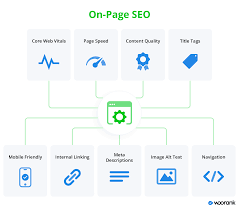
Maximizing Digital Impact: The Power of On-Page Optimization in UK Digital Marketing Strategies
On-Page Optimization in Digital Marketing The Importance of On-Page Optimization…

Maximise Your Local Presence with Google’s SEO Services
Unlocking the Power of Google Local SEO Services The Impact…

Unveiling the Best Search Engine Marketing Company for Your Online Success
The Best Search Engine Marketing Company: Driving Your Online Success…